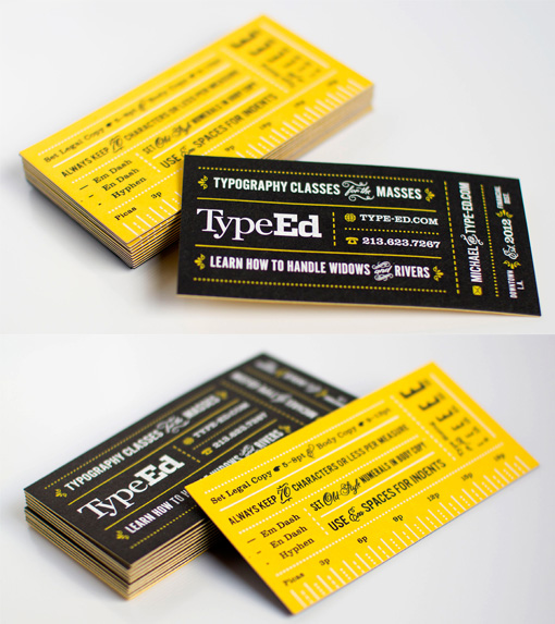
Great Typography On A Bold Black And Yellow Business Card
This card was designed for a course which is run for graphic designers and which focuses mainly on typography at its core. So of course an excellent use of typography was a must in the design of this card. The back of the card actually contains lots of handy tips and even a measurement scale for fonts so the card isn't just pretty it's useful, too! The bold black, yellow and white colour scheme shows that less is often more when choosing colours, sticking to a limited palette is a great idea when you have a complicated design to put on the small space you have in a business card.
Design by Ramp Creative
Print by BurdgeCooper
For TypeEd


