


Bold Red And Black Letterpress Business Card Design For A Graphic Designer
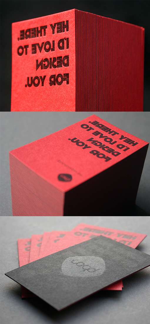
The quirky mirror image text on this card is immediately eye-catching and encourages the person holding the card to read it to see if they can decipher what it says. Fortunately, an interesting but very clear font has been used for the text, so that ultimately it's remarkably easy to read. It gives the impression that the designer who owns and made the cards can think in creative ways and see things from a different perspective. The cards have been printed via the letterpress method, which gives them a luxury feel. One side has been printed in black on red paper and the other side has been printed with a tint on black card stock. The two pieces of card have then been laminated together to create the final card, which is extra thick and appears to be striped in red and black on the edges when the cards are placed in a stack.
Design by Brice Corbin
Print by Blush Publishing
For Brice Corbin