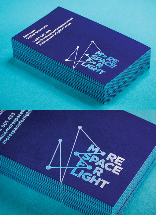
Sleek And Modern Silver Foil Business Card For A Digital Communications Consultancy
Here's another beautifully executed business card design from Adelaide based design agency Cornershop. They describe this project as such:
"More Space For Light is a digital communications consultancy specialising in digital strategy and user experience solutions. Their purpose is to enable organisations to make informed decisions based on insights and analytical data to design and grow their digital footprint. In essence, More Space For Light provide clarity and connect the dots.
Cornershop created a brand logo inspired by ‘connecting the dots’. Its colour and the brand colours, including a supporting colour gradient, is inspired by blue light emitted from computer screens. Business cards are created with duplexed 270gsm Colorplan Royal Blue & Turquoise papers. The text and logo is finished in a Silver/Laser foil to emulate the blue light gradient."
Design by Cornsershop
Print by Peacock Design & Print
For More Space For Light


