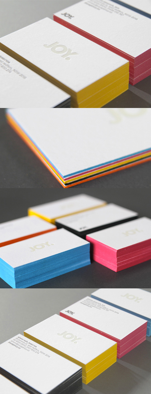
Minimalist Design White Edge Painted Business Card
This agency designed their own business cards to reflect the personality and name of the company. They did this rather cleverly by using a very subtle minimal design on the cards and reflecting the exuberance and happiness of their name in the colourful edge painting which has been used as a highlight on the cards. The cards have been printed on a nice, luxuriously thick card stock which is gently textured and feels lovely to handle. This thick card stock works well with the deeply impressed logo which has been printed with clear hot foil stamping. A great way to use bright, eye-catching colours whilst still maintaining a sophisticated and mature look.
Design by JOY
For JOY


