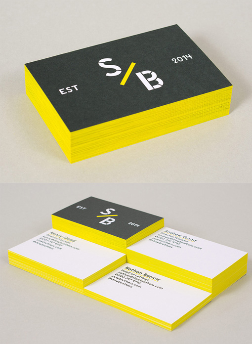
Minimalist Black And White Business Card Design With Bright Yellow Edge Painting
These cards are a great example of minimalist design and they show that the style need not be too serious or staid. The features on the cards have been pared back to a minimum and mainly focus on keeping the logo prominent. The colour palette has been limited to just three colours which keeps things from being too busy. Bright yellow for edge paint and also for just a few little details forms the highlight on these cards which contrasts vibrantly against the main black and white scheme and brings the design to life, adding spark and creativity.
Design by Build
For The Stow Brothers


