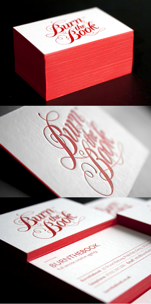
Excellent Typography Edge Painted Letterpress Business Card Design
Burnthebook is a UK based creative agency with a background in publishing. When designing their new identity and business cards they wanted to give a nod to their history. The elegant typography is reminiscent of the cover of an antique book, as is the edge painting which was chosen to represent the painted page edges found on those old books. A bold red and white colour scheme was chosen as a contemporary twist on the antique theme. The cards were letterpress printed, another tip of the hat to the history of printing but also a beautiful way to present a well designed business card.
By Burnthebook
For Burnthebook


