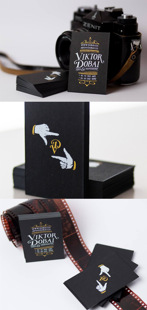
Custom Typography On An Inspirational Business Card For A Photographer
Many great business card designs place the logo boldly on the front of the card and keep all of the contact details on the back of the card where they won't interfere with or distract from the logo. On this card those contact details have been made into a work of art of their own, thanks to some beautiful custom typography. Printing contact details in plain type has its benefits in that its easy to read and is a non-risky design strategy. However with a custom font like this the owner of the cards now has stronger branding which reflects his own creative skills. The cards have been screen printed in white and gold ink on a high quality black card stock.
Design by Levente Toth
For Viktor Dobai


