15.08.2013
Contrast and Simplicity
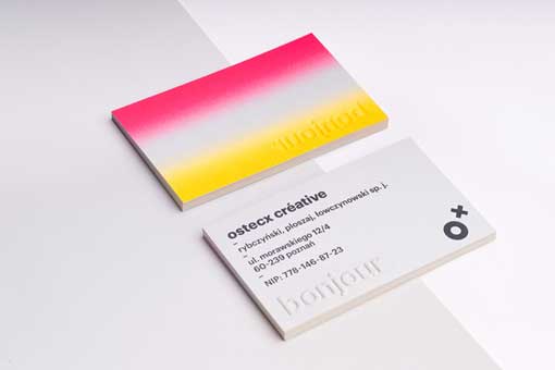
New visual identity for Ad Design firm Ostecx Creative, using contrast and simplicity to identify their brand. Fluorescent gradients were used to represent energy and contrast between advertising and design. Nicely crafted business card.
For Ostexc Creative


