


15.12.2015
Clever Use Of Texture And Typography On A Black And White Business Card For A Brand Event Manager
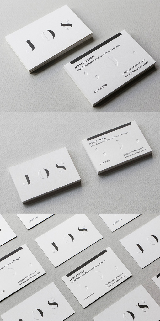
This card design makes a clever use of both typography and texture to give an extra element of interest. The front of the card has the owner's initials as the main feature and they've been printed partly in flat black and with key parts of each letter picked out with deeply debossed blind pressing. When the card is turned over those textured parts of the lettering show on the reverse as punctuation marks - like special found objects within the lettering.
Design by Ryan Romanes
For Jason O. Stevens