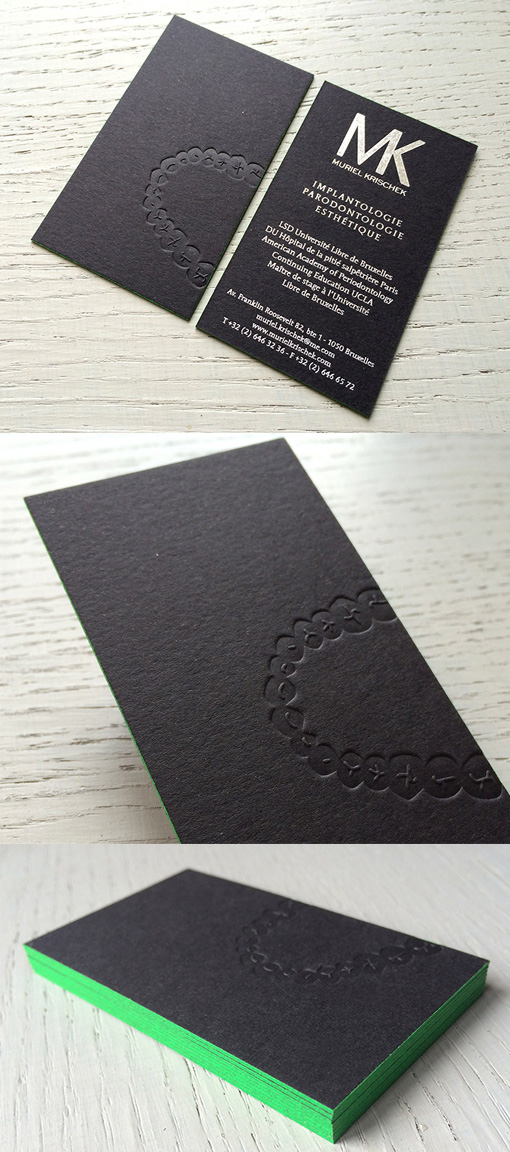
Clever Bite Mark Business Card For A Dentist
This clever business card design for an orthodontist looks like it's got a perfect bite mark impression on the front of the card. The image has been blind pressed which means that no ink was used on the printing plate when it was firmly pressed deeply into the thick card stock, leaving just the impression of the image as a texture. The black card has been lightened and the mood lifted with bright green edge painting and high contrast opaque white printing of the details on the back of the card.
Design by JWT Brussels
Print by Badcass
For Muriel Krischek


