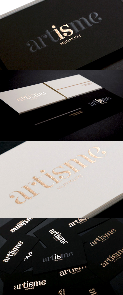
Classically Styled Black And White Business Cards For An Art Co-op
These very classy cards were designed for an interesting art co-operative project. The styling makes an interesting contrast to the grungy graffiti style street art which the artists were producing and brings a level of seriousness to the project which otherwise might have been judged as frivolous in nature. The co-op defined their work and ethic as 'artism' and named themselves 'Artisme' from this which has been cleverly used as the main design on the front of the card with metallic ink picking out just two letters to bring an extra depth of meaning to the logo. Ultimately it's hard to go past black, white and gold as a palette which can make just about any design concept sleek and sophisticated.
By Murmure
For Artisme


