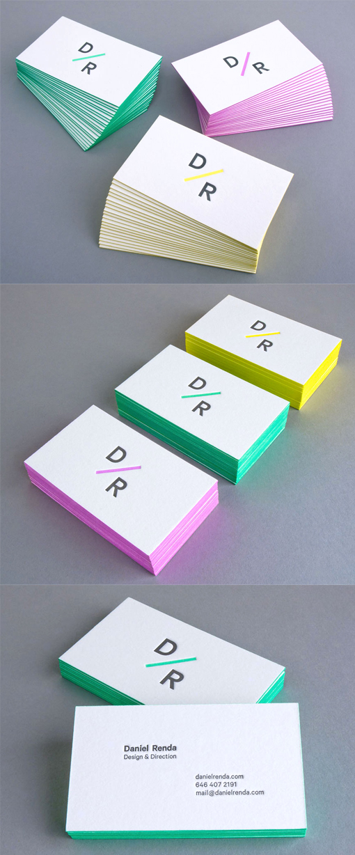
Bright Minimalist Design Edge Painted Letterpress Business Card
Daniel Renda is a graphic designer who specialises in excellent typography and design. He designed his own set of stationery and business cards, going for a clean and minimalist but eye-catching design. Because his logo itself is simple and minimalist, this is best displayed on the front of the card by itself with nothing else to clutter or distract. The back of the cards has his contact details displayed neatly and succinctly and it's easy to read. The cards have been printed with the letterpress technique on thick, high quality paper. This gives the cards a lovely texture and finish. The final edge painting in three bright colours, which each match the accent colour used in the logo, really sets the cards off and makes them highly noticeable.
By Daniel Renda
For Daniel Renda


