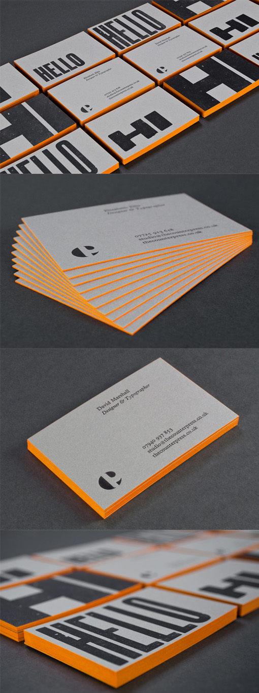
Bold Typography On An Edge Painted Letterpress Business Card For A Designer
These cards were designed by and for a letterpress and design studio. The distinctive, bold type faces come from antique type that the owners have collected and the past use and abuse of the letters shows in the printing where you can see small nicks and scratches have created a unique graininess. There's a nice contrast between the modern, bold, neon edge painting and the edgy, grainy type printed on thick grey card stock and having the type spill over the edges of the cards shows an exuberant expressiveness.
Design by The Counter Press
Print by The Counter Press


