


21.04.2015
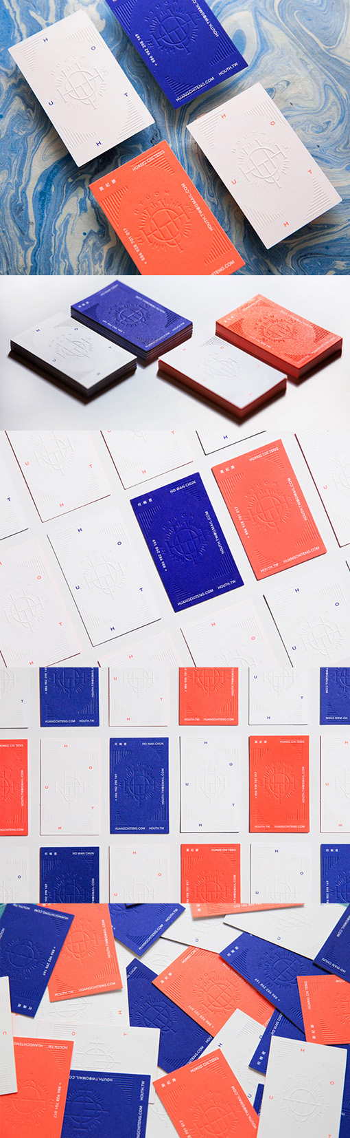
Bold Colours Contrasted With Textured White On A Letterpress Business Card
Using contrast well is a great way to design a stand out business card. This design uses strong, bold colours of deep cobalt and bright orange on one side of the cards contrasted with plain white on the back. The lettering and images have been kept to a minimum with the main feature being the beautiful blind pressed background logo image. The debossing caused by the blind pres technique can be subtle, as no ink is used in the process and the image appears just through surface texture. However on these cards, since so many elements have been kept clean and simple the blind press element of the cards is the stand out feature.
Design by H OUT H
For H OUT H