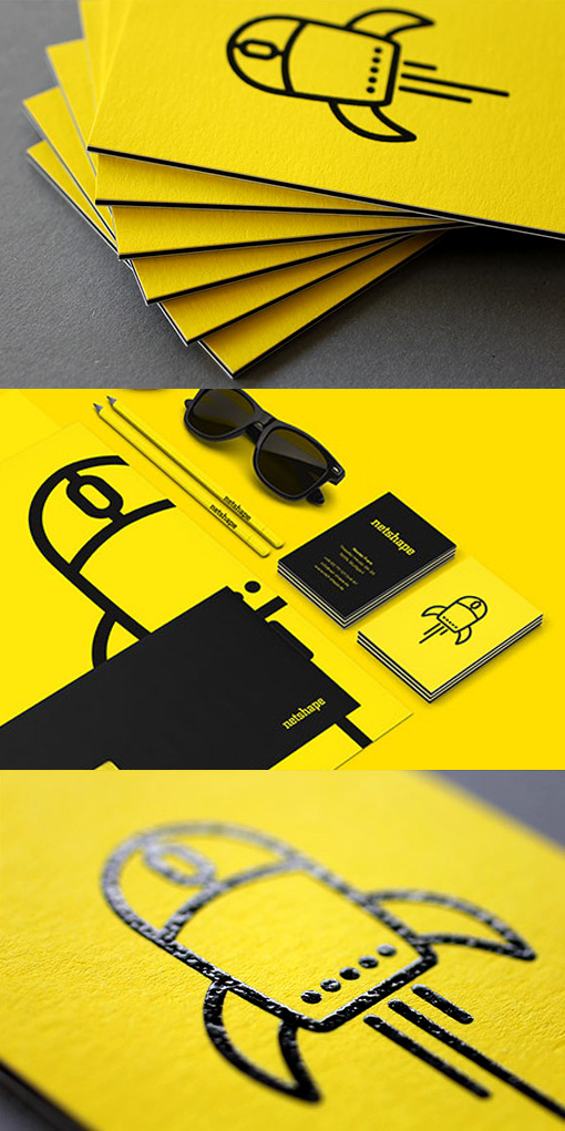
Bold Black And Yellow Business Card Design For A Web Designer
A colour scheme like this one can't fail to be noticed. The design elements have been kept minimalistic and clean to make sure that with the bright colour palette things don't get too cluttered or overwhelming. The logo has been printed with a spot UV black varnish which adds an interesting texture and a shiny contrast to the matte surface of the card stock. The cards have been triplexed, which means that three differently coloured layers of paper have been bonded together to create a super chunky card stock. Not only are the cards substantial and thick, they also have a precisely striped edge to them which would be difficult to produce any other way.
Design by Hochburg
For Netshape


