23.04.2015
Beautiful Vintage Typography Business Card Design
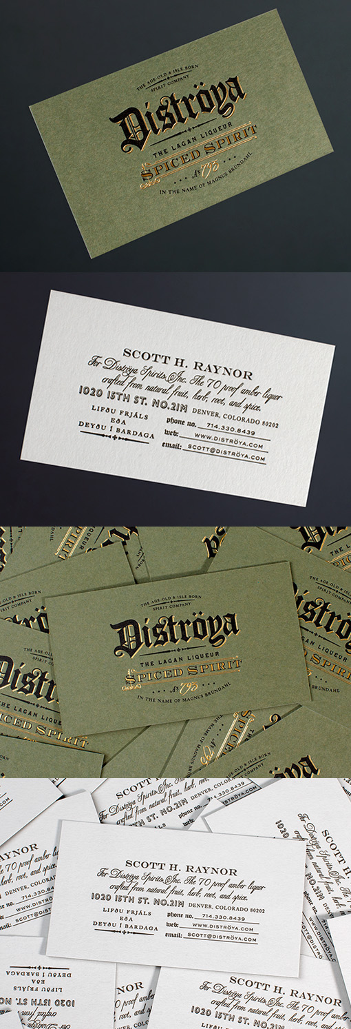
The typography on this business card design is complex and beautiful with a vintage styling that lends an air of authenticity to the brand this card represents. To add to the effect, small gold foil highlights have been used along some of the lines on the lettering. Several fonts have been used on both sides of the card but since they all tie in nicely with one another the design holds together well and hasn't become busy or confusing.
Design by Chad Michael
For Distroya


