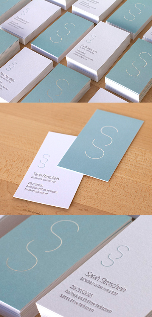
Understated But Highly Effective Pastel Minimalist Business Card Design
This set of business cards shows that you don't necessarily need bright colours or flashy special effects to produce a result with impact. Also, you don't have to stick to black and white for minimalist designs! The pastel dove grey and white come together to keep the focus on the sinuous and lovely logo and the overall effect is calming and elegant. Very fine silver foil highlights have been used on the logo to give just a little extra shine without distracting from the overall effect.
Design by Sarah Stroschein
For Sarah Stroschein


