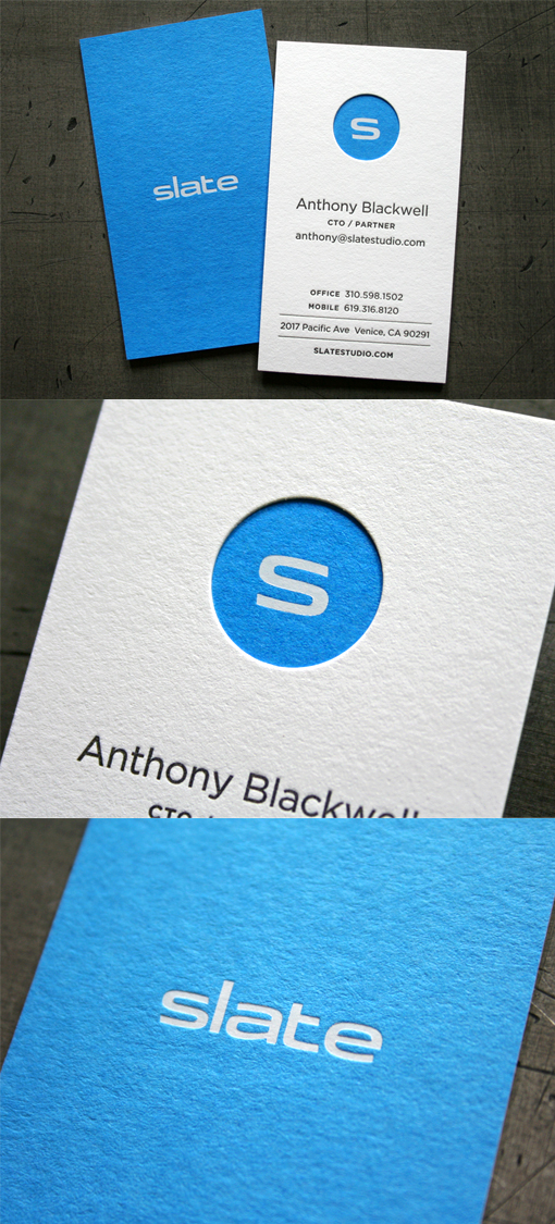
Striking Block Colour Letterpress And Die Cut Business Card Design
This card design cleverly combines three different business card printing techniques for one very striking effect. The card has first been letterpress printed on a mid blue card stock using a silver metallic ink. This ink gives a more subtle matte effect than using the super shiny hot foil stamping effect. The use of letterpress printing has impressed the logo into the surface of the card, which adds a little texture. A second card has been printed on white cardstock with the contact details in black. These white cards have then had a circular area cut out of them, using a custom die cut. Finally the white cards have been duplexed to the blue cards - this means that the two layers have been bonded together. The blue layer with a printed logo now shows through the circular window which was die cut into the white layer. The final finished cards are nice and thick and the window effect gives a texture and impression to the cards which can't be achieved with just the deep impression of a letterpress printing or embosser.
For Slate


