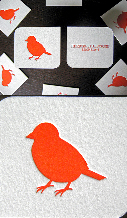
Slick And Simple Design Letterpress Business Card For A Wedding Photographer
Just one bright colour on white, a simple yet sophisticated logo and minimal typography makes for a slick and uncluttered design. The cards were letterpress printed on lovely thick 600gsm textured stock with a nice deep impression on both sides. To get a good coverage of opaque ink the bird logo was printed twice. Using just a phone number and website for details on the back of the card keeps things neat and avoids unnecessary clutter, it also means that anyone working at the studio can use these cards to hand out to clients. The cards were designed as square but as a finishing touch two of the corners were rounded off for something a little different.
By Dolce Press
For Merdekea Studios


