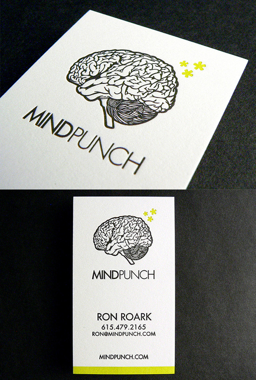
Quirky Letterpress Business Card For A Designer
The quirky design of this logo lends itself well to the letterpress printing technique. There are no large swathes of colour, which can be tricky to print nicely with letterpress, but the somewhat intricate lines of the brain design work particularly well because letterpress causes the design to become impressed into the paper. As a result, the white spaces in between the black lines have pillowed up, giving an actual 'brainy' texture to the logo! The use of just a little lime green as a highlight really makes the design pop. Printed by specialist letterpress printers The Mandate Press.
For Ron Roark


