


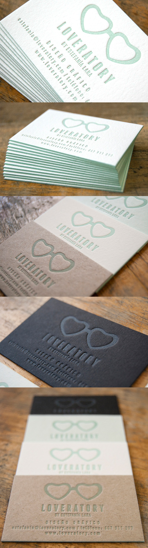
Pastel Edge Painted Letterpress Business Card For A Graphic Designer
The sweet and quirky name and design of this business card is shown off simply and elegantly by printing the cards via letterpress using just one colour and a variety of card stocks. The understated pastel tone means that the design of the logo and lettering is not overwhelmed by a gaudy bright colour or a complicated palette. The letterpress method gives a wonderful texture to the cards and shows off the luxury thick card stock that's been used. Taking advantage of the versatility of letterpress a few different versions of the cards were printed, since all that was needed was to switch card stocks it was not much in the way of extra expense to have a variety of cards printed. One of the versions even uses no ink at all - just a blind press on black stock to make the images out of texture only. The cards have been finished with matching edge painting - a detail which is great for giving a little extra lift to a business card.
Design by Loveratory
Print by El Calo Tipo
For Loveratory