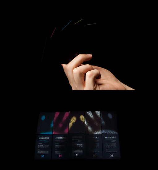
Murmurme Business Cards
Contact 2.0 shows black cards at first view with a subtle typographic varnished pattern, then when in contact with the hand the information they contain of each member of the agency appears. On one side is the agency logo and on the other side a typographic pattern made from words that characterize the different skills of the agency on a coloured background, creating a visual space that can be played with. Through this series, Murmure shows how a playful concept can be transformed into an application for communication. By exploiting this idea, the agency conveys both classical information but also concepts, which characterize specific tastes. Video of this project : http://www.youtube.com/watch?v=4vrHFBiOOZk
By Murmurme
For Murmurme


