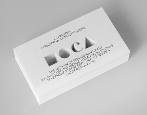
Minimalist Laser Cut Business Card Design For The Museum Of Contemporary Art
In true contemporary art fashion the Museum of Contemporary Art in California chose not to have a corporate logo on their business card. Instead, the designer of the card has represented the museum by using a set of geometric shapes and one letter to create a symbolic image of the acronym MOCA. The symbols have been die cut and when the cards are stacked a nicely three dimensional, sculptural effect is created which is very appropriate for an art museum. Overall the design is minimalist with details printed in simple clear black text and the negative space of the cut out areas providing the interest and attraction for the cards.
Design by Patrick Li
For MOCA


