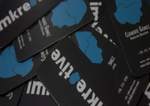
Imkreative Card Design
As far as design, I just stuck with with the newer scheme of colors I’ve been using lately which are blue green, light grey and dark grey. This keeps a familiar overall feeling when visiting the blog and portfolio. For the information side, I wanted to just get the bare minimums out there. I’ve always been turned off from business cards that have too much information on it. I think it should just be a quick introduction and if the recipient wants to learn more, they’ll call/email/etc.
By imkreative
For Clemente Gomez


