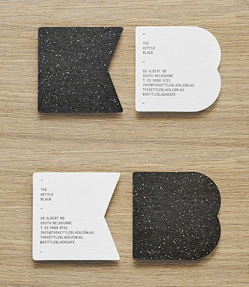
Highly Textured Black And White Custom Die Cut Business Cards For A Cafe
These cards were designed as part of an entire identity for a new up-market restaurant called the Kettle Black Cafe. The design reflects the well known phrase ‘the pot calling the kettle black’ by making subtle visual juxtapositions in a statement that is bold and complementary to the interior design of the cafe itself. The business cards have been die cut in two shapes, a blocky letter 'K' and 'B'. One surface of the card is plain white with the contact details printed in black. The other surface has a highly contrasted, thickly textured, gravelly surface in black with white flecks. The cards are both intriguing to look at and also to handle and feel.
Design by Pop & Pac
For Kettle Black Cafe


