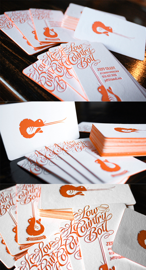
Fantastic Typography And Logo On A Letterpress Edge Painted Business Card
This business card shows that if you have a great logo then it can work well on a business card if you show it off and keep things simple. The clever logo, which is, surreally, both a shrimp and a guitar has been boldly printed in a bright Pantone burnt orange and this one colour palette has been used for the back of the card and the edge painting too. Some beautiful typography, flowing out from the shrimp's feelers makes for an impressive flip side of the card which is hard to ignore. Using letterpress printing on thick card stock gives the cards a lovely texture and extra substance. Deep impressions have been made into both sides of the paper from the letterpress printing process - this is what gives that great texture but it can interfere with images on either side of the card - the designer of the card took extra care to make sure that the positioning of design elements would work well with the printing process for a very professional end result.
Design by Brandy Waggoner
For Low Country Boil


