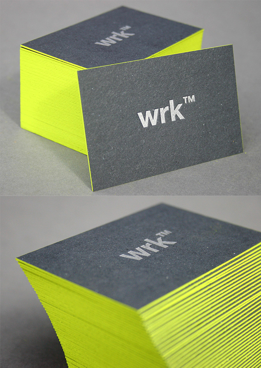
Eye-Catching Neon Edge Painted Black Business Card Design
Here's another great example of minimalist design being used to great effect. By distilling the design elements of the card down to just a few features the message is conveyed simply and effectively with all distractions and clutter removed. Subtle details enhance the design without ruining the fundamental concept - the cardstock isn't plain black, it's a recycled stock which has a little colour and texture in the background. Logos are very important branding-wise for a company and simple placement of the logo on the front of the card with no other elements makes it very distinct. The text and logo have been printed in a metallic ink on the black card - it's not super-shiny like hot foil stamping processes are but gives a slick and classic effect which isn't gaudy. Finally the card has been given an eye-catching zing with edge painting in a bright neon colour to ensure that it's one that will be remembered and will stand out from all the other black business cards out there.
By Blush
For wrk


