


17.12.2013
Contrast Edge Painted Letterpress Business Card
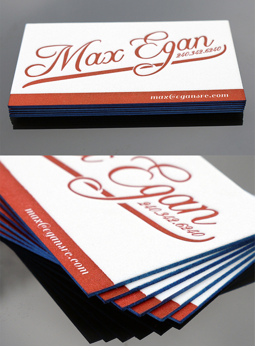
When picking a colour for edge painting most of the time people will pick a colour that's already in the design or logo on the face of the card, which generally works well and is an easy way to add some spark to a card. On this card a contrasting colour has been chosen for the edge painting and the combination of bright blue edges and striking red typography is really eye-catching. The entire effect is fresh and contemporary, making this card stand out nicely. The card was printed by a letterpress studio on 236lb cotton paper card stock which is nice and thick for edge-painting.
By Mike James
For Max Egan