


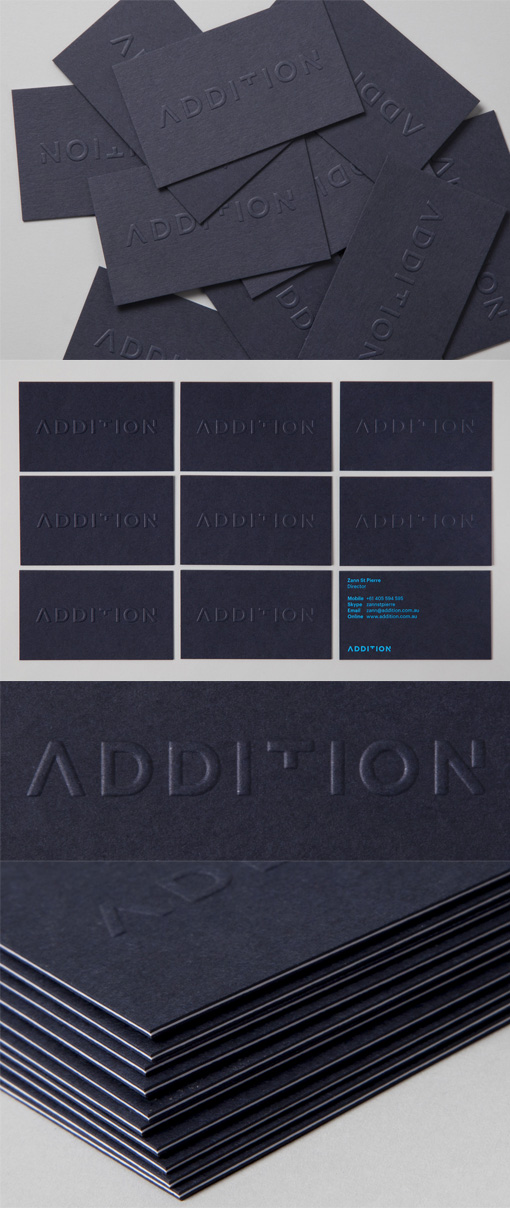
Clever Logotype On An Embossed Letterpress Business Card
The main feature of this minimalist design business card is the highly textured embossed logo on the front of the card. The logotype has been cleverly designed to take advantage of the name of the company itself with certain small elements of some of the letters having been subtracted from the name "Addition". The removal of those elements shows that although the name can still be easily read there are small things that are needed to make the name "complete". One can then derive the inference that the company and its services can find these missing elements and put them just where they need to be. The cards have been beautifully printed using the letterpress technique and have also been triplexed - a white card stock has been sandwiched between two outer layers of navy card stock and all of the pieces have then been laminated together to create one final extra thick card which has subtle but perfect striping on the edges.
Design by Thought Assembly
For Addition