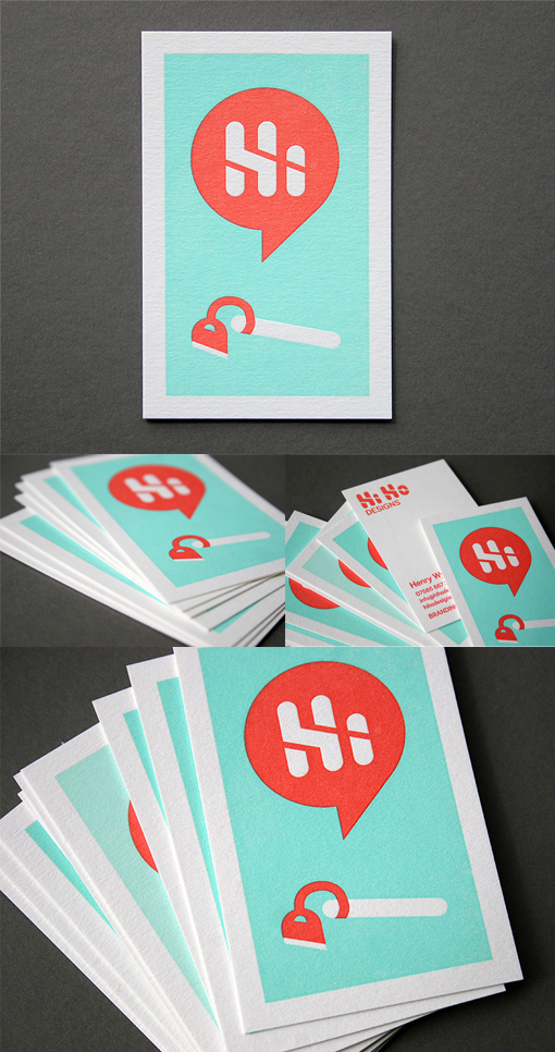
Clever Illustration For A Letterpress Business Card
A bold illustrative style and a clever pictorial representation of the company name has been used on the front of this business card design for maximum impact. The style lends itself well to a two colour printing process which has been beautifully rendered by a specialist letterpress printing studio. As simple as the print job might appear it was actually quite difficult to execute this neatly - the large area of aqua ink could have bled in a displeasing way if not carefully printed and the second colour had to be registered very accurately to avoid overlapping the aqua or leaving white space in unwanted areas. The studio did a great job though and the result was perfect.
For Hi Ho


