


15.06.2015
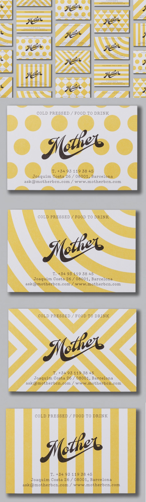
Bold Patterns Show Off Great Typography On A Business Card For A Natural Beverage Company
A simple concept which has been very well executed. The logo for this company consists of the name drawn in flowing, sloped typography. It looks great on its own but it doesn't hurt to draw attention to this artfully created logo so it's been placed on to backgrounds of simple but very bold patterns in bright yellow. Black, yellow and white is a colour scheme that cannot fail to grab attention but despite the bold colours the logo is not overshadowed but rather attention is drawn to it, which is very important as part of a branding and marketing project.
Design by Mucho
For Mother