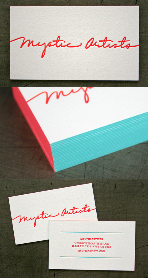
Beautiful Typography On A Two Toned Edge Painted Letterpress Business Card
Simple minimalist design and a two colour palette show off the lovely typography of this company's logo to great effect. The cards have been letterpress printed on a thick white card stock which was duplexed after printing to make the cards even thicker. Letterpress printing has the added effect of adding texture to the cards and this gives them a luxurious feel. Edge painting has become a very popular effect to use on business cards to make them stand out, here the technique has been tweaked so that the two colours from the printing run have each been used on two sides of the cards. An unusual use of this concept which does require some care in the execution of the technique to make sure that the colours don't overlap or bleed into each other on the corners of the cards.
For Mystic Artists


