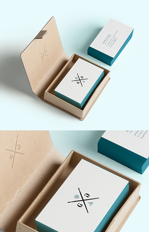
Beautiful Minimalist Design Edge Painted Letterpress Business Cards For A Watercolourist
This set of business cards is a great example of cleanly executed minimalist design. The logo has been designed to look like the devices on a shield or crest and they reflect the tools of the trade of the owner of the cards - an illustrator who uses watercolours as their main medium. The logo is the only design element on the front of the cards, which means that all of the focus is on identity design. Details have been printed clearly on the back of the cards and no extra clutter or complication has been introduced. A strong turquoise has been chosen for the edge painting - it complements the overall colour palette and gives a bright pop of colour to the cards without overwhelming the minimalist design features.
Design by Lisa Gaugl


