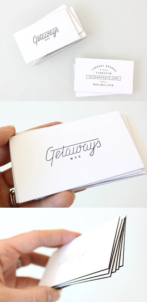
Vintage Typography On A Sophisticated Black And White Edge Painted Business Card
This black and white business card design shows just how well a clean and uncomplicated black and white design can work. The beautiful typography is showcased on the front of the card, it has great impact because there's nothing else there to be distracting. The details on the back of the card have been printed in a plainer text which has been artfully arranged so as to make sure it's not boring to read. Printing just black on a thick, high quality white card stock keeps the design clean and uncluttered and goes to show just how well a simple colour theme can work. The cards have been letterpress printed which gives them a luxuriously textured finish and the final edge painting in black is the finishing touch which really makes each card pop.
For Getaways


