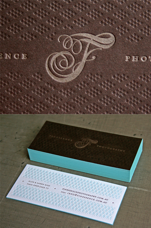
Luxurious Texture And Typography On A Letterpress Business Card For A Photographer
The beautiful texture and typography on these business cards gives them a luxury feel which reflects the high quality fine photography produced by the company they represent. The texture has been achieved by letterpress printing which can leave a deep impression into thick card stock such as this. To make the stock thick enough two layers of card were bonded together via a method called duplexing. This had the added bonus that with two different colours of stock used the card is white on one side and a rich mahogany colour on the other. The beautiful feminine typography of the letter 'F' is nicely contrasted against the heavy, masculine dark background. The teal edge painting and white and teal colour scheme on the back of the card also contrast nicely with the dark card front.
For Finessence


