


Great Typography Edge Painted Letterpress Business Card
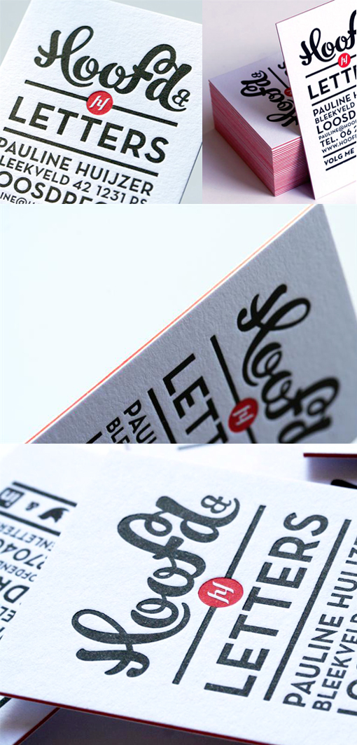
Hoofd&Letters is a Dutch marketing and communication company. Hoofd&Letters is Dutch for Head and Letters and symbolizes the balance between emotion and reason which was visualized by using hand-drawn typography together with a sans serif typeface. The designer of the cards wanted the business cards to be special, so he went for letterpress as the printing technique as it gives a beautiful finish and texture to the cards. The 'edge painting' was actually achieved by using triplexed paper - a layer of red card was sandwiched between a front and back layer of white card and all of the layers bonded together to create one thick cardstock which has a red band visible at the edges. This red core symbolizes inner passion from the heart.
By Rens Dekker
For Hoofd&Letters