


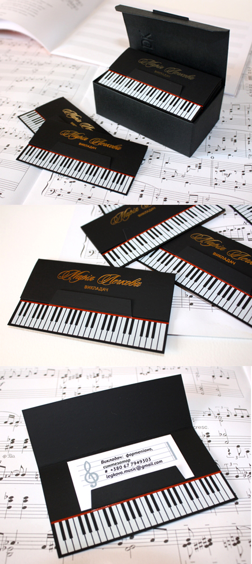
Clever Die Cut Black Business Card Design For A Piano Teacher
As a basic concept, a business card which looks like a piano keyboard is a fairly straightforward choice for a piano teacher's business card. However with this design it's the details and execution which have really been done well and which bring this card up a notch. The card has a folding cover with the teacher's name written with lovely typography in foil stamped gold. This nicely mimics the piano maker's title one normally sees on a good piano. The flap is cleverly held in place by a tab which doesn't just stop the flap from lifting up it also becomes the music shelf of the piano when the design underneath is revealed. The teacher's details are on the sheet music propped on this shelf and set out as if they were musical notation. With the flap lifted up it looks like you've opened an upright piano, ready for playing. Overall a great design taken to the next level so as to encourage people to interact with and become more interested in the card.
For Legkova Music