


25.11.2010
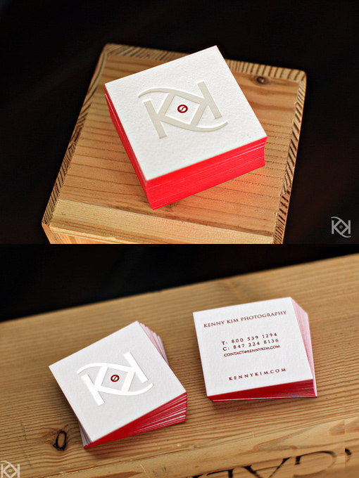
White on White Lettra Paper
I agree with his assessment of the importance and power inherent in having a card that artfully represents your work. Kenny’s clean cut KK logo, which he designed himself, speaks strongly, even with the understated white-on-white color palette. The spark of deep red in the centered lens/yin-yang symbol is reiterated in the flash of red edge painting, and in the information printed on the back. Six hundred gram Cranes Lettra paper gives even more weight to these gorgeous and graceful pieces of art that, according to Kenny, never fail to elicit an interested, astonished response. read Kenny's take on having a great business cards at www.studiozmendocino.wordpress.com
By Kenny Kim
For Studio Mendocino