02.12.2011
Web Designer Card
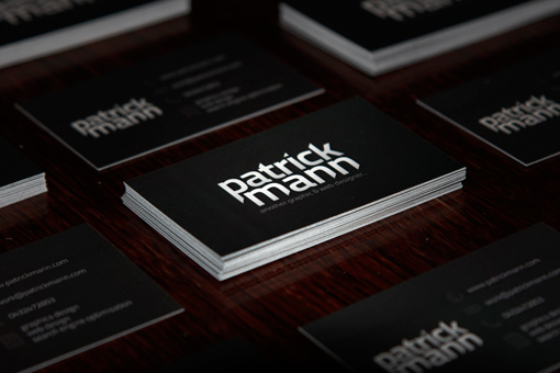
I needed to create a business card for myself that would be subtle, yet eyecatching while reflecting the look and feel of my website, particularly the contrast effect. The design ended up with a dark background with the logo and a short phase on the back, while on the front the logo and text are mainly centered. A small icon represents each.
By Patrick Mann
For Patrick Mann


