


26.04.2012
TV Editing Identity Design
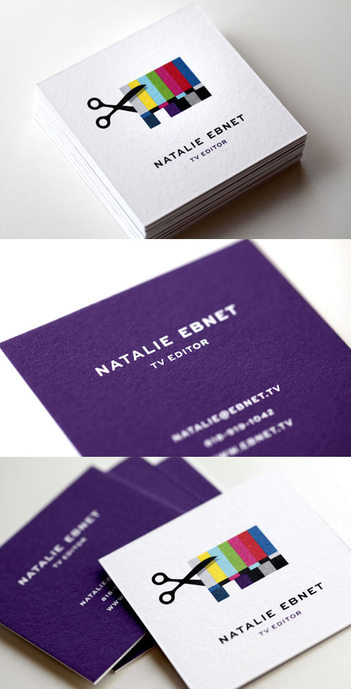
Great identity design for TV editor Natalie Ebnet. The logo is self-describing of her work as an editor, a TV screen in color-coded mode with a pair of scissors applied to the logo.
The cards are a 2.5″ square and are printed on 110lb. Crane Lettra Flo White which we duplexed to get to 220lbs, so they are extremely thick. Because the logo is so colorful, we used 4 color offset printing on the front and a printed a spot color on the back. We just got them back from the printer this week and they turned out great!