


Outside the Box Design
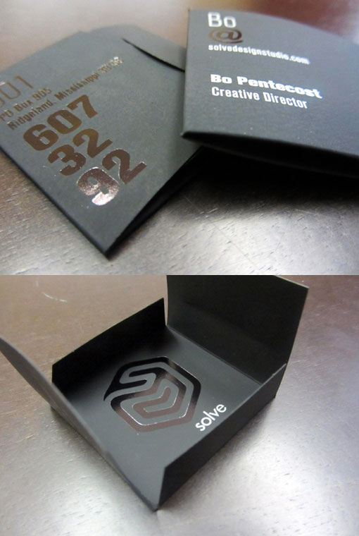
Solve's logo is a visual metaphor (labyrinth) for thinking within and outside of 'the box.' Therefore we really wanted the business card to interact with the audience and have them explore the different design decisions we took during the creative process. We made hierarchies of what information is most important to us and emphasized them throughout, for example: 1. Our phone number was to be predominant. This is how people contact us the most. 2. The merger of our emails and our nicknames. Bo's name is actually Douglas, but everybody knows him as Bo. Hence his email is also bo@solvedesignstudio.com. I'm usually referred to as V (my name is Virgilio), hence v@solvedesignstudio.com. 3. Finally, we thought the most important information to convey was NOT the logo, but our personal contact information. Isn't that what business cards are for in the first place. This helped us apply the logo very large in the inside of the card. It also allowed a great negative space on the information side. Print Process Details: Paper: Black Soft Touch (80lbs.) Color: Silver Pantone Other: Dye Cut and Black foil.
By Virgilio Guardado and Bo Pentecost