


07.02.2013
Orpo Business Card
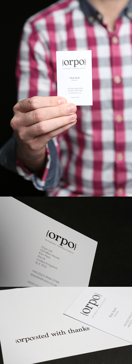
A serif font was used and the colour black was key to this identity. Clear and crisp were the keywords of the client and thats whats been delivered here. The identity has been paired down for use as an avatar also making this a mark thats unforgettable.
The business cards have been printed on GFSmith Colorplan White Frost to give them a luxurious look and feel. The contrast between the pure whiteness of the stock and the black identity make this a really punchy business card
By Keith Riches
For Orpo