Moo.com Moo.com Moo.com Moo.com Moo.com Moo.com Moo.com
Ordered List
02.01.09

Ordered List

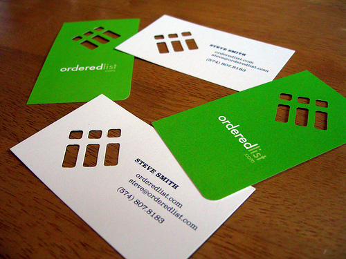
Steve wanted a very simple, elegant, but memorable card. We decided that URL and phone number was the only essential information to simplify the amount of type. The branding was carried out with a die cut that allowed Steve’s logo to take on the surface characteristics of whatever the card was set on, contrasted against the white face of the information side of the card. The orderedlist.com text on the back is positioned so that the card is read horizontally on the information side and vertically on the green side. In this manner the logo always “reads” properly, with the set of three smaller elements up and to the left.

By Tim O’Connor

For Ordered List

Inspired? Grab some cards by MOO.com
  • StumbleUpon
  • Digg
  • Facebook
  • del.icio.us
  • Google Bookmarks

5 COMMENTS

  • 02.02.09
    Luke Dorny

    Ahhhhh, nice job, Tim.
    Clever front/back thinking on this one.

  • 02.02.09
    Linda Lee

    What a striking card this is…I luv it.

  • 02.03.09
    derl

    all the cards on here are awesome but i really like the punched out effect

  • 02.03.09
    vincent b.

    Too bad the card actually pictures an unordered list with bullets… I find the concept really cool and the name of the company beautiful. (call me geek seeing poetry in XHTML element name, indeed I am!)

  • 02.05.09
    Jonathan Minns

    I really like this idea. im loving the cut out.
    i may use this idea in some of my work.
    J.Minns

What do you think? Leave a Comment