Newer Card
Older Card
Tweet
18.03.2009
IE Design
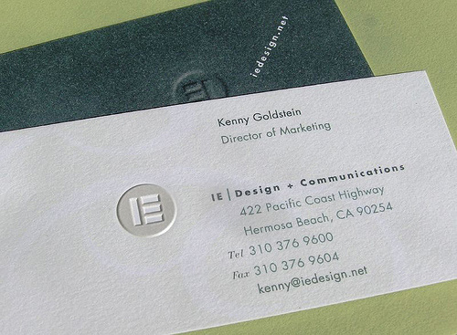
Business card of IE Design.
By
IE Design