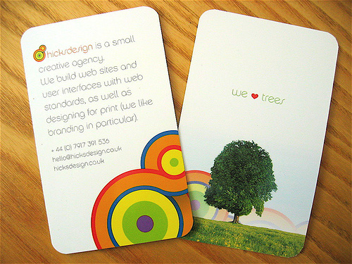
02.16.09
HicksDesign
Rounded corners with a Spot UV varnish on the logo to make it shine against the matte laminate.
For HicksDesign
| Tweet |
|
|
Rounded corners with a Spot UV varnish on the logo to make it shine against the matte laminate.
For HicksDesign
| Tweet |
|
|
Mike Salkewicz
I know that the design studio Blue Source closed up shop some time ago, but the logo that HicksDesign is using is WAY too close for comfort to one of Blue Source’s projects (search for the GAS series book about them). Wonder if Hicks is an offshoot of Blue Source, or just horrible at trying to mimic.
Ryan Quattlebaum
If you sift through the hicksdesign.co.uk archives, you’ll find that he launched the current logo in June of 2006. Comments (http://bit.ly/vLbPN) ballpark Blue Source shutting their doors in early 2007. I think that’s a little too close to call either way without actually talking to someone who was at Blue Source or some more research.
Anyway, I love the vertical design of the card and sentence describing Hicksdesign’s passions. And the ‘We ♥ Trees’ makes me smile.
Mike Salkewicz
However, the GAS series book was published in October 2002 (http://www.amazon.com/Blue-Source-Gas-Book-8/dp/486083268X/ref=sr_1_1?ie=UTF8&s=books&qid=1235061828&sr=8-1) and features the design in question right on the front cover. Same shape and color interweaving, just a different color band configuration.
Even so. If Mr. Hicks was an employee of Blue Source, and was responsible for the design, I question the appropriateness of repurposing a client project as one’s self identity.
I just have an uneasy feeling about this, considering I recognized the source inspiration so clearly.
Ryan Quattlebaum
Thanks for the fact check. I didn’t have time to do much research between classes, so all I could find was the date for the Hicksdesign logo. I’ll admit that they do look very similar, which is a little questionable.
Henry
Come on you all. Get your Gravatar on. Your making my design look like its been taken over by blue silhouettes.
http://gravatar.com/
Joseph
I’m not sure that the lack of Gravatars should be your main concern, Henry. People are (at least) speculating that your logo is a copy of another well-known design company’s – I’m not pointing a finger, but if I were your prospective clients I’d be very worried about this. The two logos are _extremely_ similar.
Henry
@Joseph – I think I have confused you. Sorry about that. I am not part of Hicks Design. I own this site, Card Observer.
Joseph
Ahh, my apologies, Henry!
WebDesigner
beautiful…… very nice
Beautiful Hot Business Card Designs « littleboxofdesign
[...] Hicksdesign [...]
Beautiful Hot Business Card Designs | LITTLE BOX OF DESIGN
[...] Hicksdesign [...]
How to Choose the Right Colors for Business Card Design
[...] Image: Patrick Carter [...]
How to Choose the Right Colors for Business Card Design
[...] the target audience. Image: Patrick Carter Determine the group of people that you want to reach. This can help you to choose the colors that [...]