Newer Card
Older Card
Tweet
19.06.2009
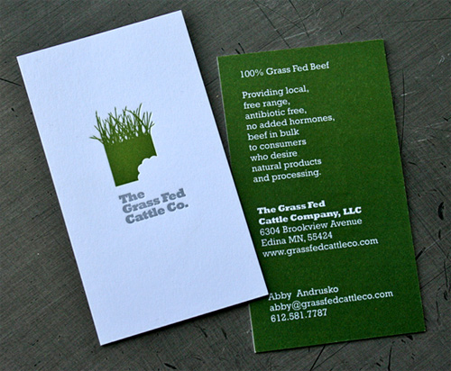
Grass Fed Cattle Company
Letterpress printed by
Studio on Fire
.
By Michael Skjei
For
Grass Fed Cattle Company