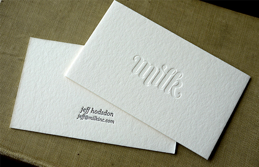
Deceptively Simple Minimal Design Shows Off Gorgeous Typography On A Business Card
With this card it's all about the logo, which uses beautiful custom typography to great effect. Since the logo itself is such a nice piece of design it can be used very effectively in this very popular design style. The logo has been letterpress printed with a very deep blind impression on the front - this means that no ink is used and the logo is visible by the texture made on the card stock. The text on the back has been printed in black with a shallower impression to contrast against the appearance of the front of the card. The use of only the barest minimum of contact information is in keeping with the design theme.
By Hoban Press
For Milk


