


30.01.2014
Creative Typography Letterpress Business Card Design
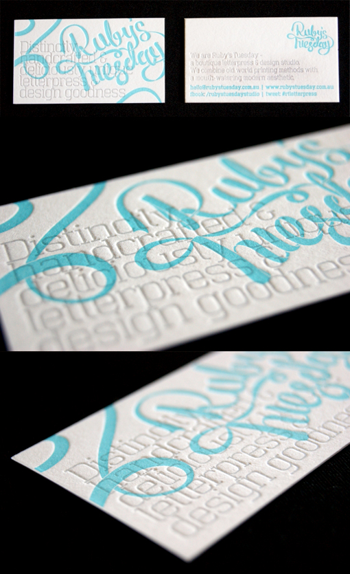
These cards were designed by and for a small Australian boutique letterpress studio. The design uses two contrasting typography styles with a soft colour palette and the combination comes off very well. The turquoise business name has been printed in the background with the business information overprinted in a very pale grey. This pale colour would ordinarily be difficult to see but as it has been used as part of a deeply debossed letterpress print the pale ink actually makes the texture more visible and so the lettering is perfectly legible. In the close up pictures you can really see how nicely the deep texture comes up on this thick 600gsm cardstock.
For Ruby's Tuesday