


Cool Business Card - DG
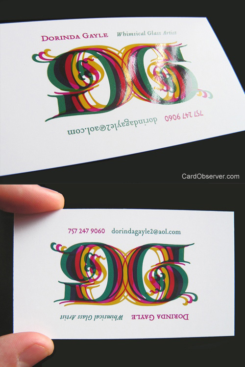
Cool business card designed for an abstract glass artist whose work is colorful and bold. Her work can be appreciated from all angles, in fact, it has been hung incorrectly in galleries because it is so abstract. To represent this aspect of the artist's work, her initials were used to created an ambigram as her logo. We wanted the business card to further emphasize the logo by giving it some of the characteristics of glass such as transparency. We also mimicked the shine of glass with a spot UV coating over the ambigram. The information surrounding the logo is designed to emphasize the ambigram because as you turn the card to read the bottom line of text, the logo reads the same. This forces the card holder to physically interact with the card rather than just passively read it. The other side of the card continues this concept by repeating the design rotated 180°.
By RageHaus
For Dorinda Gayle