


04.01.2016
Bold High Contrast Business Cards With Interesting Typography
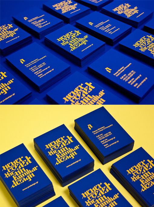
These business cards really pack a punch with just two colours. The colours chosen are a bright primary blue and yellow and the result is a very eye-catching high contrast design. The choice of colour highlights the unusual bespoke typography on the front of the cards. The cards have been printed using a yellow foil on a blue card stock - the use of foil is important because it ensures that the yellow is truly opaque. If printed in ink the yellow colour would most likely have appeared somewhat muddy with the blue bleeding through from underneath and this would have minimised the impact of these cards.
Design by Panos Nikolaou
For Panos Nikolaou